

A few weeks ago we discussed situations where the average bias gives enough information that you don’t need to examine bias in more detail. In method comparisons, this is typically not the case. Instead, you need to evaluate bias as a function of concentration. But how is that done?
What is linear regression all about, and what does it have to do with bias?
In the previous blog post about bias we discussed fitting a horizontal line to a difference plot to describe the average bias. When we examine our data using a linear regression model, we can basically turn to the regression plot to do a similar examination.
On a regression plot, the y-axis represents the candidate method, and the x-axis represents the comparative method. Results of all samples are drawn on the plot. A line is then fitted to these results to represent the difference between the methods. The distance between the regression line and the y=x line represents bias.
Images 1, 2 and 3 visualize this for three different data sets. In Image 1, bias seems relatively constant on an absolute scale. The results given by the regression model are consistent with the calculated average bias. The slope of the regression line is near to 1 (1 falling within the 95% CI of the slope), and the effect it has on bias estimation is minimal compared with the effect related to the intercept. Average bias (calculated as absolute mean difference) gives a reasonable estimation to describe the whole data set.

Image 1: On the left, the absolute mean difference is drawn to the constant difference plot. The blue horizontal line shows where the mean difference is, while the black horizontal line shows where bias would be zero (result of candidate method – result of comparative method = 0). On the right, a regression model has been used to draw a regression line to the regression plot. The blue line shows the regression line, while the black line shows where bias would be zero (result of candidate method = result of comparative method).
Also, in Image 2, the results given by the regression model are consistent with the calculated average bias. Now bias seems nearly constant on proportional scale. The intercept of the regression line is near zero (95% CI of intercept containing zero), and the effect it has on bias estimation is minimal compared with the effect related to the slope. Average bias (calculated as relative mean difference) gives a reasonable estimation to describe the whole data set.

Image 2: On the left, relative mean difference is drawn to the proportional difference plot. The blue horizontal line shows where mean difference is, while the black horizontal line shows where bias would be zero (result of candidate method – result of comparative method = 0). On the right, a regression model has been used to draw a regression line to the regression plot. The blue line shows the regression line, while the black line shows where bias would be zero (result of candidate method = result of comparative method).
In Image 3, on the other hand, mean difference (nor median difference) does not describe the behavior of the data set throughout the whole measuring interval. Yet, it is possible to fit the linear regression line to the regression plot. In this case, the regression line has a relatively large positive intercept, while the slope is significantly smaller than 1. This leads to positive bias on small concentrations and negative bias on large concentrations.

Image 3: On the left, mean difference is drawn to the constant difference plot. The blue horizontal line shows where mean difference is, while the black horizontal line shows where bias would be zero (result of candidate method – result of comparative method = 0). As we can see, average bias does not describe the bias of the data set throughout the whole measuring interval. On the right, a regression model has been used to draw a regression line to the regression plot. The blue line shows the regression line, while the black line shows where bias would be zero (result of candidate method = result of comparative method).
Linear regression analysis is used to find the regression line that best describes the data set. Bias at a specific concentration is obtained by calculating the distance between the regression line and x=y line at that specific concentration.
You may remember that we have mean and median values as options for finding an estimate for average bias. Both have their own benefits in estimating bias. Whether one is better than another depends on the data set.
Similarly, multiple models can be used in finding the regression line. We will introduce the ordinary linear regression model, weighted least squares model, Deming model, weighted Deming model, and Passing-Pablok model, as those are the established regression models used in method comparisons. All of them are available in the measurement procedure comparison study in Validation Manager.
Ordinary linear regression – the simplest model there is
Probably the most commonly known regression model is ordinary linear regression (OLR, also known as ordinary least squares OLS). Because it’s relatively simple, it gives useful examples when you try to understand the basic idea of linear regression. And back in the old days, when we didn’t have such fancy computers and software, it also had the benefit that it could be calculated with reasonable effort.
OLR is actually meant for finding out how a dependent variable y depends on an independent variable x (e.g., how the price of an apartment in specific types of locations depends on its size). The idea is to minimize the vertical distance of all points to the fitted line. Values on the x-axis are used as they are, assuming they do not contain an error.
In method comparisons, our variable on the y-axis is not really dependent on our variable on the x-axis. Instead, both y and x are dependent on true sample concentrations that are unknown to us. This makes the case a little different than what ordinary linear regression has been designed for. The reasoning for using ordinary linear regression anyway is that the values on the x-axis are kind of our best existing knowledge about the true concentrations. If the error related to each data point is small enough and other assumptions of the model are met, the use of ordinary linear regression is justified.
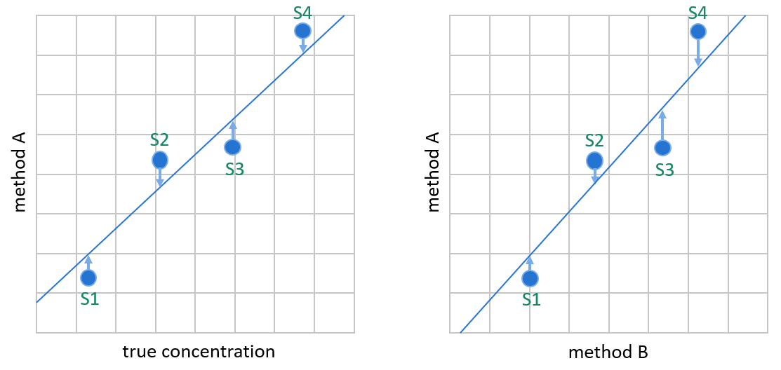
Image 4: OLR creates the linear fit by minimizing the vertical distance between data points and the regression line. It is meant for situations where the variable on the y-axis is dependent on the variable on the x-axis, like on the left, where we plot values given by method A (our candidate method) against true sample concentrations. In method comparisons, the values on the x-axis are not true concentrations but results given by method B (e.g., the method used so far for measuring these concentrations). In most cases, method B gives about as good approximations of the true concentrations as method A.
When can you use ordinary linear regression and why you shouldn’t
When we use linear regression in measurement procedure comparisons, the underlying assumption of ordinary linear regression that there’s no error in results given by our comparative method is never really true. However, there may be cases when this error is negligible compared with the range of measured concentrations, and therefore will have little effect on our bias estimation. In that case, this assumption is close enough for the purposes of linear regression. This is checked by calculating the correlation coefficient. If r is at least 0.975 (or equivalently r2 is at least 0.95) we can consider this assumption to be met.
Ordinary linear regression also assumes that the error related to the candidate method follows the normal distribution. Basically, this is required to justify estimating bias with a similar logic as when you calculate mean value. Assumption of data being normally distributed also enables us to calculate confidence intervals.
In ordinary linear regression, standard deviation (SD) of the data is assumed to be constant on absolute scale throughout the measuring range. When talking about clinical laboratory measurement data, this assumption is often unrealistic. Analytes with a very small measuring range tend to show constant SD, but with a small measuring range, the first assumption of r>0.975 can be challenging to achieve. You can use the constant difference plot and the scatter on a regression plot to visually evaluate whether the data set shows constant SD, but it’s not easy to be sure that this assumption would hold.
Image 5 shows an example data set where the assumptions of ordinary linear regression may hold. In the middle, we have a difference plot on an absolute scale using direct comparison, i.e., the comparative method is on the x-axis. On the left, we have a constant Bland-Altman difference plot, where the mean of both methods is on the x-axis. (For more information about difference plots, see the earlier blog post about average bias.) Looking at the difference plots and the scatter on the regression plot on the right, the assumptions of constant SD and normal distribution of errors are reasonable. Pearson correlation r = 0.981. Therefore, ordinary linear regression can be used.

Image 5: Example data that seems to fulfill the assumptions of OLR. In the middle, the constant difference plot shows data in direct comparison on an absolute scale. On the left, the constant Bland-Altman difference plot shows data on an absolute scale. On the right, regression fit by OLR.
Now let’s compare different regression models to represent this data. In Image 6, we can see regression plots using three different regression models. On the left, the regression line is created using the ordinary linear regression model. In the middle, we can see that the Deming model gives very similar results as OLR. On the left, Passing-Bablok has a little bit larger confidence intervals, and we can easily see that the linear fit is a little different than with the other models. If we are confident that SD is constant and normally distributed throughout the measuring range, the ordinary linear regression and Deming models can both be used.

Image 6: The same example data as in Image 5 that seems to fulfill the assumptions of OLR. On the left, regression fit by OLR. In the middle, regression fit by Deming model. On the right, regression fit by Passing-Bablok model.
The only benefit of using ordinary linear regression instead of the Deming model or Passing-Bablok is that it’s easier to calculate. Deming regression model works just as well in cases where ordinary linear regression model would be justified, and it doesn’t require us to check the correlation.
When using Validation Manager, you don’t need to worry about how complicated the calculations are. Therefore, the only valid reasoning to use ordinary linear regression instead of Deming regression is if considering the comparative measurement procedure as a reference happens to suit your purposes.
How about weighted least squares?
If the variability of the data does not show constant SD, but instead constant %CV (i.e., the spread of the results on the regression plot grows wider as a function of concentration), the simplest regression model to use is weighted least squares (WLS).
In weighted least squares, each point is given a weight inversely proportional to the square of the assumed concentration (i.e., the value on the x-axis). After that, the linear fit is created by minimizing the vertical distance between data points and the regression line. Thanks to the weights, values at low concentrations have a higher influence on where the regression line will be drawn than high concentrations. Otherwise, the high variance at high concentrations could pull the regression line to one or the other direction depending on what kind of a scatter the samples happen to show. This would deteriorate the bias estimation.
Otherwise, the ordinary linear regression model and weighted least squares model make practically the same assumptions of the statistical qualities of the data set. Error is assumed to be found only in the vertical direction, and this error is assumed to be normally distributed. The difference is whether variability is expected to show constant SD or constant %CV.
The constant SD assumption of the ordinary linear regression model made it possible to use correlation as a measure of whether the error related to the results is small enough that we can omit the error related to the comparative method in our calculations. With constant %CV there’s no similar rule of thumb that could be used in evaluating whether using the weighted least squares model is justified.
One way to examine the reliability is to switch the comparison direction (i.e., which method is the candidate method, and which is comparative) and see how much it affects the bias estimation.
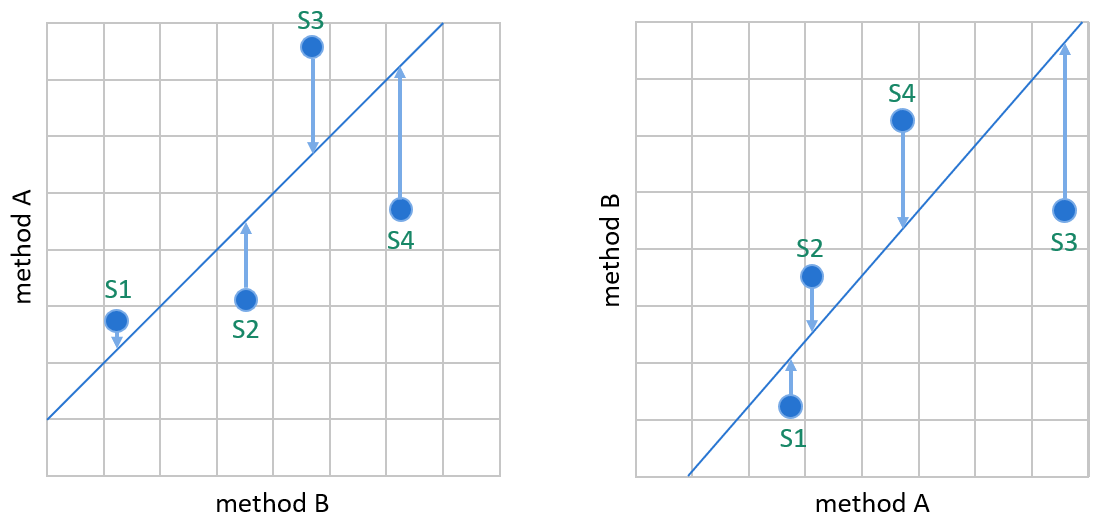
Image 7: WLS creates the linear fit by minimizing the vertical distance between data points and the regression line so that the result of the comparative method defines the weight of a data point in the calculations. On the left, method A is our candidate method, and method B is our comparative method. On the right, the same data is plotted the other way round, having method B as the candidate method.
Image 7 shows why switching the comparison direction can have a significant effect on the bias estimation given by weighted least squares. If we compare the methods the other way round, it’s a different method whose results are considered to contain an error that explains the distance of the data point from the regression line. The assumed true concentrations of samples may change significantly. For example, on the left, S3 is interpreted to have smaller concentration than S4. On the right, S3 is interpreted to have a larger concentration than S4. These kinds of effects may cause bias estimation to be affected by which method is used as a comparative method. In this example, the upper end of the regression line is clearly placed differently into the graphs. (Similar effects are also possible when using ordinary linear regression, though the correlation requirement keeps it rather small.)
This is the main problem with weighted least squares. Comparison direction affects the interpretation of sample concentrations. Unlike in ordinary linear regression, the assumed sample concentration affects how a sample is weighted in weighted least squares calculations. There is no way to evaluate how much the error related to the comparative method affects the results.
To get a better idea about what this means, look at Image 8 and Image 9. In Image 8,
we have plotted the same data set to the regression plots. On the left, method A is our candidate method, while on the right, method B is our candidate method. Regression fit is done using weighted least squares to both these graphs. Comparing the two graphs, we can clearly see that the regression line has been placed differently into the data set. On the left, the linear fit goes through the two data points of lowest concentrations (S1 and S2). On the right, these dots are clearly below the regression line. A little bit up the concentrations, sample S5 seems to touch the regression line on the left. On the right, there’s clearly some distance between the dot and the regression line. When we continue up the concentrations to the next data point that seems to touch the regression line, we find sample S16 below the regression line in both graphs. That means that on the left, it’s assumed that the random error related to method A is negative in that data point. On the right, it is assumed that the random error related to method B is also negative in that data point. As we are calculating bias between methods A and B, these two interpretations are clearly in conflict with each other.

Image 8: Linear fits of one example data set. On the left, the weighted least squares method is used. On the right, the comparison direction is reversed, and WLS is used. Reversing the comparison direction clearly affects the linear fit. The same data using the weighted Deming model and Passing-Bablok model is shown in Image 9.
Image 9 shows us the regression plots of this same data set with method A as the candidate method. In the middle, we see the linear regression fit made by the weighted Deming model. As the weighted Deming model accounts for the errors in both methods, it’s not surprising that the linear fit goes through sample S16 placed below the regression line on both graphs in Image 30. The regression line created by Passing-Bablok on the right is quite concordant with the results of the Deming model, but the confidence interval is significantly wider. If we are confident that %CV is constant and errors are normally distributed throughout the measuring range as WLS requires, the weighted Deming model is a better choice than the weighted least squares model.

Image 9: Linear fits of the same example data set as in Image 8. On the left, the weighted least squares method is used. The weighted Deming model is used in the middle and Passing-Bablok on the right. Reversing the comparison direction does not affect the linear fit when using the weighted Deming or Passing-Bablok methods, but it does affect their confidence intervals.
So basically, weighted least squares is never a reasonable choice unless considering the comparative measurement procedure as a reference happens to suit your purposes.
Deming models handle error from both methods
Deming models take a slightly more complicated approach to linear regression. They make a more realistic assumption that both measurement procedures contain error, making them applicable for data sets with less correlation. Otherwise, the reasoning behind these models is quite similar to the reasoning behind ordinary linear regression and weighted least squares.
That’s why we can think that Deming models improve our bias estimations compared with OLR and WLS, similarly as Bland-Altman comparison improves average bias estimation compared with direct comparison. Both methods are now assumed to contain error, but we are still effectively calculating mean values to estimate bias.
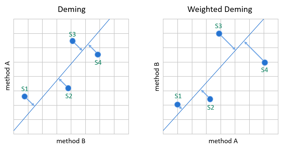
Image 10: Deming models minimize the distance between data points and the linear fit without assuming that one of the methods would be a reference method. Since the errors of both methods are handled in calculations, switching the comparison direction does not cause significant differences in the calculated values. On the left, the Deming model that assumes constant SD. On the right, the %CV.
To handle situations where one of the measurement procedures gives more accurate results than the other, both Deming models use an estimate of the ratio of measurement procedure imprecisions to give more weight to the more reliable method. For similar measurement procedures, this ratio is often estimated as 1.
Otherwise, the assumptions are similar to OLR and weighted least squares. Deming models also assume symmetrical distribution. Random errors that cause variance on candidate and comparative measurement procedures are assumed to be independent and normally distributed with zero averages.
Variance related to random error is assumed to be constant on an absolute scale (constant SD when using Deming regression) or on a proportional scale (constant %CV when using Weighted Deming regression) for each method throughout the measuring range.
Deming regression models are very sensitive to outliers. If you use either one of the Deming models, you will need to ensure that all real outliers are removed from the analysis. In Validation Manager, this is rather easy, as the difference plot shows you which results are potential outliers. After considering whether a highlighted data point really is an outlier, you can remove it from the analysis with one click.
Passing-Bablok survives stranger data sets
Clinical data often contains aberrant results. The distribution may not be symmetrical. Often variability (neither SD nor %CV) of the results is not constant throughout the measuring range. Instead, it is mixed, e.g., showing absolute variability at low concentrations and proportional variability at high concentrations.
In average bias estimation, we had to use median instead of mean for skewed data sets. Similarly, in linear regression, we need to use the Passing-Bablok model.
Passing-Bablok regression model does not make any assumptions about the distribution of the data points (samples nor errors). It basically calculates the slope by taking a median of all possible slopes of the lines connecting data point pairs. Correspondingly, the intercept is calculated by taking the median of possible intercepts. As a result, there are approximately as many data points above the linear fit as there are below it.
Passing-Bablok regression also has the benefit of not being sensitive to outliers. That basically means that it’s ok not to remove them from the analysis.
Image 11 shows one example data set that is too difficult for the other regression models to interpret. Mere visual examination of the regression lines created with weighted least squares (upper left corner) and weighted Deming model (lower left corner) raises doubt that these regression lines do not describe the behavior of the data set very well. Also, with the weighted Deming model, the 95% CI lines are so far from the regression line that the only way to interpret this result is to conclude that the weighted Deming model doesn’t tell us anything about this data set. Predictions made by the constant Deming model (lower right corner) seem more convincing, but as the data set doesn’t really seem to have constant SD and normally distributed errors, the use of the Deming regression model is questionable. Passing-Bablok (upper right corner) is the model to use in this case, though it is advisable to measure more samples to get more confidence in the linearity of the data and to reach a narrower confidence interval.

Image 11: Regression plots with four different regression models. As the correlation is only 0.803, OLR is not shown.
The challenge with Passing-Bablok is similar to using median as the estimated average bias. As a nonparametric technique it requires higher sample size than a parametric technique such as Deming model. For example, in Image 6 and Image 9, this could be seen in the wider confidence interval of the Passing-Bablok regression fit. So in cases where the assumptions of a Deming model hold and your data set is small, the appropriate Deming model gives more accurate results than Passing-Bablok.
However, when examining medical data, one can quite safely use a rule of thumb that the assumptions of Deming models (nor OLR or WLS) are not met and Passing-Bablok is a better choice. And the less data you have, the it is to know whether the variability really is constant and whether the errors follow a normal distribution or not.
How much samples are needed?
If you gather your verification samples following the CLSI EP09-A3 guideline and your data is linear, it’s pretty safe to say that you have enough samples. In many cases, though, laboratories perform some verifications with a smaller scope, as there’s no reason to suspect significant differences.
With smaller data amounts, it is good to check the regression plot and the bias plot to see how the confidence interval behaves. With Passing-Bablok, the confidence intervals tend to be quite large with small data amounts. (Though, as we can see in Image 11, it depends on the data set whether Deming models perform any better.) In that case, you basically have three options. You can add samples to your study to make a more accurate bias estimation. Optionally you can evaluate whether your data set would justify using either of the Deming models instead. But you might also find average bias estimation sufficient for your purposes.
The importance of having enough samples is visualized in Image 12.
Here we have measured sets of 10 samples that all represent the same population. All three data sets have been created with identical parameters. The only difference between them comes from the random error normally distributed with %CV 15%. What this means is that the same set of samples could lead to any of these data sets. For each data set, the upper graph shows weighted Deming regression fit, while the lower graph shows Passing-Bablok regression fit. For all the data sets, Passing-Bablok shows wider confidence intervals than weighted Deming does. The data set in the middle shows a significantly smaller bias than the others. So, with small data sets, it depends on your luck how well the calculated bias really describes the methods.

Image 12: Three data sets were all taken from the same population with %CV 15%. Basically, measuring the same set of samples could lead to any of these three data sets.
When we combine these three data sets into a single verification data set of 30 samples, we get the regression plot shown in Image 13. The difference in the confidence intervals is big compared with Image 12, where none of the data points were left outside the area drawn by Passing-Bablok confidence intervals.
To really get an idea about the behavior of bias, we recommend setting goals for bias. After that, the bias plot in Validation Manager shows a green area on concentration levels where your calculated bias is within your goals. The orange background shows where the goals were not met.
Image 13 shows a bias plot for the same data set on a proportional scale and on an absolute scale. In our example data set, we have a goal of bias < 2 mg/dl for concentrations smaller than 30 mg/dl, and bias < 7% for concentrations larger than 30 mg/dl. If our medically relevant areas happen to be below 27 mg/dl and above 36 mg/dl, bias calculated from the regression line seems ok. But in this case, the upper limit of our confidence interval is way above the goals, which should worry us and give a reason for further investigation.

Image 13: Data sets of Image 12 combined. On the left, the regression plot shows a Passing-Bablok regression line. In the middle, a bias plot on a proportional scale. On the right, a bias plot on an absolute scale. On the bias plots, the blue line represents the calculated bias. The dashed blue lines show the confidence intervals of bias. The other dashed lines show where our bias goals are.
In addition to the amount of data, it’s also worth considering how well the data covers the measuring interval. Whichever regression model you use, all relevant concentration areas should show multiple data points. Otherwise, mere chance can have a significant effect on the results.
Image 14 shows regression plots for three data sets of 19 samples that all represent the same population. All three data sets have been created with identical parameters. The only difference between them comes from the random error normally distributed with %CV 15%. For each data set, the upper graph shows weighted Deming regression fit, while the lower graph shows Passing-Bablok regression fit. The data set on the left looks like there’s maybe no bias at all, while the other data sets clearly show bias. As most of the data is on low concentrations, it’s difficult to say how the bias behaves at large concentrations. That’s why it is recommended to measure more samples of high concentrations to cover the measuring range more evenly.

Image 14: Three data sets were all taken from the same population with %CV 15%. Basically, measuring the same set of samples could lead to any of these three data sets.
What if it’s not linear?
There may be cases when no straight line would describe the behavior of the data set. Small peculiarities in the shape of the distribution may be ignored if it seems that their effect is within acceptable limits. But if the distribution is somehow strongly curved, a linear fit will not give meaningful information about the bias.
In these cases, you can divide the measuring interval into ranges that will be analyzed separately. This is done on the Validation Manager report, where you can add new ranges. You can set the limits of the range by looking at the difference and regression plots to make sure that your range selection will be appropriate, as shown in Image 37. This way, it is possible to get separately calculated results, e.g., for low concentrations and high concentrations.
Image 15: Selecting a range in Validation Manager to be analyzed separately.
Another question, of course, is whether the nonlinearity between the methods indicates a bigger problem with the candidate method. Bias is supposed to be calculated within the range where the methods give quantitative values. Usually, a method is supposed to behave linearly throughout this range. If both methods should be linear throughout the whole data set, nonlinearity between them may give reason to suspect that one of the methods is not linear after all. To investigate this, you can perform a linearity study.
If you want to dig deeper into regression models, here are some suggestions for further reading:
-
CLSI Approved Guideline EP09-A3 – Measurement Procedure Comparison and Bias Estimation Using Patient Samples
-
Deming regression in Wikipedia
-
W.E. Deming (1943), “Statistical adjustment of data”. Wiley, NY (Dover Publications edition, 1985). ISBN 0-486-64685-8
-
K. Linnet (1990), “Estimation of the linear relationship between the measurements of two methods with proportional errors”, Stat Med. Vol 9, Issue 12 p 1463-1473.
-
Passing-Pablok regression model in Wikipedia
-
H. Passing, W. Bablok (1983), “A new biometrical procedure for testing the equality of measurements from two different analytical methods. Application of linear regression procedures for method comparison studies in clinical chemistry, Part I.” J. Clin. Chem. Clin. Biochem. Vol 21, Issue 11 p 709-720.
-
W. Bablok, H. Passing, R. Bender, B. Schneider (1988),”A general regression procedure for method transformation. Application of linear regression procedures for method comparison studies in clinical chemistry, Part III” J. Clin. Chem. Clin. Biochem. Vol 26, Issue 11 p 783-790
Accomplish more with less effort
See how Finbiosoft software services can transform the way your laboratory works.