

How to estimate the average bias over the whole measuring range? And how to recognize situations where the average bias gives enough information that you don’t need to examine bias in more detail? We have already introduced correlation, now let’s start our journey towards a better understanding of bias.
Our first step is to discuss different numbers describing the average bias over the whole data set within a comparison study. We look at when one number can describe bias and which number to use for that purpose. Regression models and bias as a function of concentration are not explained at this point. We will return to them in a later blog post.
What is bias, and when is it measured?
Bias is the systematic error related to a measurement, i.e., how much the results differ on average from a reference. Practically all measurement setups contain both systematic and random error. The purpose of estimating bias is to get knowledge of systematic error.
In some cases, systematic errors can be corrected by calibration, adjustment of reference ranges, or otherwise fine-tuning the interpretation of results. (Random error is more difficult to control, as it represents the unexpected, and it should be estimated in a separate measurement setup, preferably using ANOVA protocol.)
Bias is evaluated in clinical laboratories, for example:
-
When introducing new methods or instruments, to make sure that their results are good enough to be used in diagnostics.
-
To gain knowledge of consistency between parallel instruments.
-
When the reagent lot changes, to check whether the new one performs as well as the previous one.
-
When an instrument is moved to a new location.
-
To monitor changes in performance over time, e.g., each month.
As multiple things can be compared, we will mostly be using a general term measurement procedure to represent a measurement setup that’s being compared with another. A measurement procedure consists of the used instrument and method, among other things that may affect the results. Basically, any of these individual parameters can be taken under examination to gain knowledge of whether varying conditions in the measurement setup cause bias.
How is bias estimated?
There are two ways of estimating bias.
In cases where bias is constant, we can find one value to describe the bias throughout the measuring range. This approach is suitable, e.g., when performing parallel instrument comparisons. As we can expect the method to behave consistently in all instruments, it is reasonable to assume that the amount of bias does not vary as a function of concentration.
In cases where bias is constant, we can find one value to describe the bias throughout the measuring range.
In cases where bias varies over the measuring range, a single value cannot be used to describe bias at all concentration levels. Instead, we need to define bias as a function of concentration. This can be done by calculating a regression equation describing the bias at different concentrations. We’ll get back to this in a later blog post, but, generally, this is the case when you compare different methods to each other.
When using Validation Manager, you get the estimate for constant bias and regression analysis automatically for all your comparison data. So, you really don’t have to choose between these two approaches. You can look at the results to decide which result to use as your bias estimate. Especially when performing parallel instrument comparisons with small amounts of data, it may be that regression analysis does not really give any better information about bias than the average bias.
Different ways of looking at the difference
To get an estimate for the average bias throughout your measuring range, the first thing you need to do is to get an idea about what you are actually comparing. You also need to consider what is the information you are looking for. Based on these choices, you will decide whether to use the Bland-Altman approach or direct comparison to create your difference plots and to calculate the average bias.
A difference plot is a visualization of the differences of results from each sample as a function of concentration. That means that on the y-axis, the position of a data point is determined by how much the results of the candidate and the comparative measurement procedures differ from each other. On the x-axis, the position is determined by the concentration to which we are comparing. The y-axis can show the difference in reporting units (absolute scale) or as a percentage difference (proportional scale, difference per concentration). Example can be seen in Image 1.
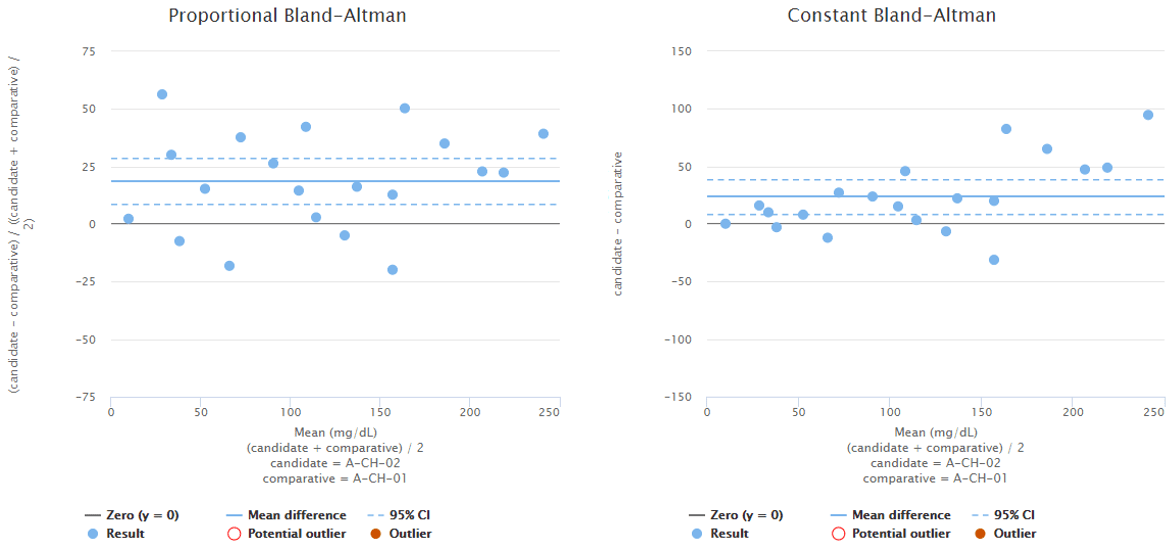
Image 1: Bland-Altman plots using proportional (on the left) and absolute (on the right) scale. Both graphs visualize the behavior of the same fictional data set.
What’s the thing with Bland-Altman all about?
Usually, when evaluating bias, we do not have access to a reference method that would give true values. Instead, we have a comparative measurement procedure (e.g., an instrument that will be replaced by a new one) that we assume to give about as accurate results as the candidate measurement procedure. Sometimes we even expect the candidate measurement procedure to be better than the comparative measurement procedure. That’s why we cannot calculate the actual trueness (i.e., bias compared with true values) of the new measurement procedure by just comparing the results of our candidate measurement procedure to the comparative measurement procedure.
So, what does the bias mean if we don’t have access to a reference method? How can we estimate trueness?
In this case, the use of the Bland-Altman difference is recommended. It compares the candidate measurement procedure to the mean of the candidate and the comparative measurement procedures.
The point of the Bland-Altman difference is pretty simple. The results of both candidate and comparative measurement procedures contain errors. Therefore, the difference between their results does not describe the trueness of the candidate measurement procedure. Instead, it only gives the difference between the two measurement procedures. That’s why, if we want to estimate trueness, we need a way to make a better estimation about the true concentrations of the samples than what the comparative measurement procedure alone would give.
Bland-Altman difference compares the candidate measurement procedure to the mean of the candidate and the comparative measurement procedures.
Typically, we only have two values to describe the concentration of a sample: the one produced by the comparative measurement procedure and the one produced by the candidate measurement procedure. As mentioned above, the candidate measurement procedure often gives at least as good an estimate as the comparative measurement procedure. That’s why the average of these results gives us a practical estimate for the true values (i.e., the results of a reference method). It reduces the effect of random error and even the weaknesses of an individual measurement procedure in estimating the true value. This makes the Bland-Altman difference a good choice when determining the average bias.
When not to use Bland-Altman difference?
If you are comparing the results of the new measurement procedure to a reference method (i.e., true values), you should compare the measurement procedures directly. This means that the results given by the candidate measurement procedure are simply compared with those given by the comparative measurement procedure.
Also, if you are not really interested in the trueness of the new measurement procedure but rather want to know how the new measurement procedure behaves compared to the one you used before, direct comparison is the right choice. This is typically the case in parallel instrument comparisons, lot-to-lot comparisons, and instrument relocations. If you want to, you can use replicate measurements to minimize the effect of random error in your results.
When a laboratory replaces an old method with a new one, they may choose either of the approaches depending on their needs. For example, when you adjust the reference ranges, the difference between the methods tells you how to change the values. That’s why direct comparison is often more practical than the Bland-Altman approach.
To use direct comparisons and/or average results of sample replicates in Validation Manager, you can simply change the default analysis rule settings on your study plan.
Your choices related to the analysis rules define what the reported numbers really mean.
Your choices define what the reported numbers really mean. That’s why it’s important to consider whether Bland-Altman comparison or direct comparison suits better to your purposes. Otherwise, you may end up drawing false conclusions from your results.
Difference between Bland-Altman difference and direct comparison is shown in Image 2 and visualizes why the conclusions you can draw from a graph may differ depending on whether you are using direct comparison or the Bland-Altman approach. The image shows difference plots of the same data set using direct comparison (on the left) and Bland-Altman approach (on the right). The scale on x-axis reaches higher values on Bland-Altman plots than on direct comparison plots because the candidate method gives higher results than the comparative method. With some other data set, it could be the other way round. The scale on y-axis differs between the graphs that show proportional difference due to the same reasons. The shape of the distribution differs between graphs, most prominently on high concentrations, where direct comparison gives a more even scatter of the results around the mean value.
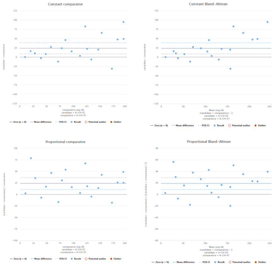
Image 2: Difference plots of the same data set using direct comparison (on the left) and Bland-Altman approach (on the right).
Visual evaluation of the difference plot
After making these decisions and adding your data to Validation Manager, you can examine the difference plot visually. Make sure that the desired measuring interval is adequately covered. In an optimal situation, the measured concentrations would be relatively evenly distributed over the whole concentration range. Often this is not the case. Then you need to make sure that all clinically relevant concentration areas have enough data to give an understanding of the behavior of the measurement procedure under verification.
To give you and example what this could mean, Image 3 shows constant Bland-Altman plots of two different fictional data sets. On the left, data is distributed evenly throughout the measuring range. On the right, there’s quite a lot of data at low concentrations but only a couple of data points at high concentrations. If high concentrations are medically relevant, it is advisable to add more data to high concentrations.
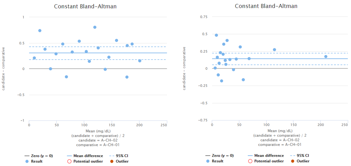
Image 3: Constant Bland-Altman plots of two different fictional data sets. On the left, the whole measuring interval is covered evenly. On the right, most of the data is on low concentration levels.
When would a single value describe the bias of the whole data set?
For one bias estimate to describe the method throughout the whole measuring range, bias should seem constant as a function of concentration either in absolute or proportional scale. Evaluating this visually is easier if the variability of differences also behaves consistently across the measuring interval. Variability can be constant on an absolute scale (constant Standard Deviation, SD) or on a proportional scale (constant Coefficient of Variation, %CV). If bias is negligible, you can choose whether to examine it on absolute or proportional scales based on which one shows a more constant spread of the results. If there is visible bias, you will need to estimate visually whether it seems more constant on an absolute or proportional scale.
To demonstrate this, Image 4 shows examples of two fictional data sets. On the left, you can see proportional and constant Bland-Altman plots of a data set with sample concentrations distributed evenly throughout the measuring range. Looking at the graphs on a proportional scale, the data set seems like it may be described by average bias, as the blue horizontal line that represents the mean difference is quite nicely fitted into the data set. However, on high concentrations, all the dots are above the mean difference, which may be due to variance in the results but may also indicate growing bias. To be sure, one might measure more samples with high concentrations. On the right, there are proportional and constant Bland-Altman plots of another data set with sample concentrations distributed evenly throughout the measuring range. Looking at the graphs, on a proportional scale, one might think that bias varies throughout the measuring range, and there seems to be one potential outlier, but on a constant scale, the bias seems constant, and there are no outliers.
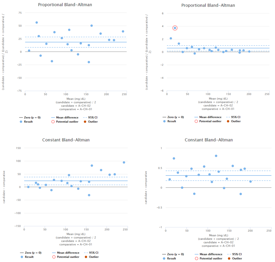
Image 4: On the left, proportional and constant Bland-Altman plots of a fictional data set with sample concentrations distributed quite evenly throughout the measuring range. On the right, proportional and constant Bland-Altman plots of another fictional data set with sample concentrations distributed quite evenly throughout the measuring range.
When looking at the difference plot, you should also screen for possible outliers in the data. Validation Manager helps you in this by doing a statistical analysis of the data. On the difference plot, Validation Manager shows a red circle around values that seem to be outliers. If there are outliers, you should investigate the cause and assess whether the result really is just a statistical outlier. If it is, you can easily remove the data point from the analysis by marking it as an outlier.
To give you an example, Image 5 shows Bland-Altman plots using proportional (on the left) and absolute (on the right) scale. Both graphs visualize the behavior of the same fictional data set. Statistical analysis on the data reveals one possible outlier on both of the graphs and Validation Manager highlights them with a red circle. Before marking an outlier, we need to consider whether the behavior of the data is better described on proportional or on absolute scale. Only after that we can know which one of the circled data points would be a statistical outlier. Other considerations may also be needed before marking an outlier.
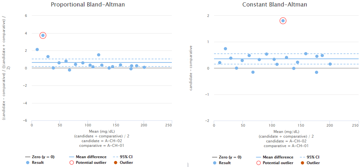
Image 5: Bland-Altman plots using proportional (on the left) and absolute (on the right) scale. Both graphs visualize the behavior of the same fictional data set.
Finally, you should evaluate how the results behave as a function of concentration. Could you draw a horizontal line through the difference plot that would describe bias behavior on all concentration levels? Validation Manager helps you in this by drawing a blue line to represent the mean difference. If a horizontal line would describe the data set, you can consider the bias to be constant.
What value to use as average bias estimate?
When bias is constant throughout the measuring range, we can use one value to describe bias. But what value should we use?
Validation Manager shows the mean difference on your overview report. It is calculated as an average over individual differences of samples. Image 6 shows the equations for calculating the mean difference, where xn,cand is a value measured from sample n using candidate measurement procedure, xn,comp is a value measured from sample n using comparative measurement procedure, and N is the number of samples. The equation to use depends on your decisions and observations described above.
Image 6: Equations for calculating mean difference, where xn,cand is a value measured from sample n using candidate measurement procedure, xn,comp is a value measured from sample n using comparative measurement procedure, and N is the number of samples.
You usually should use this value if you want to use the average bias as your bias estimate. To evaluate the reliability of this value, there are two more things that you should be looking at.
First, the confidence interval. As your data set does not represent your measurement procedures perfectly, there is always an element of uncertainty in the calculated values. Confidence interval describes the amount of doubt related to the calculated mean value. If the CI range is wide, it is advisable to measure more samples to gain more accurate knowledge of the behavior of the measurement procedure.
When using Validation Manager, it’s easy to find the confidence intervals of your results. Image 7 shows the overview report table with some example data. For every comparison pair, the table shows the measuring range, mean difference, and bias calculated using the selected regression model. Results are highlighted with green or orange color depending on whether or not the calculated values are within set goals. Below the calculated mean difference, the 95% confidence interval is shown.

Image 7: Overview report table with some example data. Below the calculated mean difference, the 95% confidence interval is shown.
Second, you should assess whether the variability of the data is even enough. For skewed data sets, the mean difference does not give a good bias estimate. . If they match, the mean difference gives a good estimate. (Please note that this check does not guarantee that the data would be normally distributed.) If the mean and median values differ significantly compared with each other, the median difference gives a better estimate. The drawback of using the median is that estimating the confidence interval is trickier than it is for mean difference. It requires more data points to give reliable results, so you may need to measure more samples to have confidence in your results.
Image 8 shows Bland-Altman plots using proportional (on the left) and absolute (on the right) scale. Both graphs visualize the behavior of the same fictional data set. The blue horizontal line in each graph represents the mean value (on a proportional or absolute scale) so that you can visually evaluate how well it describes the data set. Above the graph, you can find calculated values for mean and median differences (both proportional and absolute differences). This data set is clearly skewed, so that mean difference gives a somewhat higher estimate for bias than the median difference. Therefore, median value would give a better estimate of bias than mean value. If you want to compare these graphs to graphs showing a data set that is not skewed, look at, e.g., Image 4.
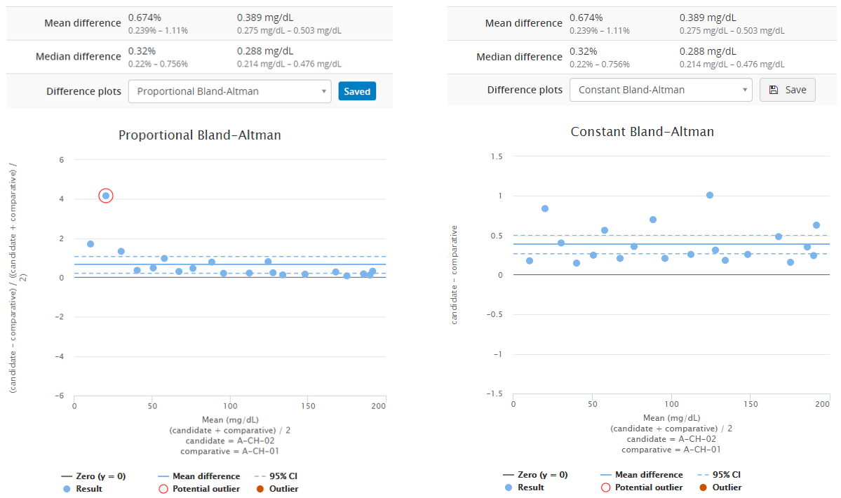
Image 8: Bland-Altman plots using proportional (on the left) and absolute (on the right) scale. Both graphs visualize the behavior of the same fictional data set.
Some of our users are interested in sample-specific differences. While these values may be relevant in some cases, they do not represent bias very well. If you do not average over multiple replicate measurements, sample-specific results show random error in addition to the systematic error. That’s why they do not tell us much about bias.
To show you how this looks like on a Validation Manager report, Image 9 shows the test runs table showing measured results and calculated difference for all samples related to the compared measurement procedures. The user can select whether to view these differences as absolute or proportional differences.
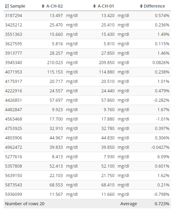
Image 9: Test runs table showing measured results and calculated sample specific differences.
How to make it easier if you have loads of data
If you have multiple identical instruments measuring the same analytes with the same tests, going through all of this for all the instruments takes a lot of time. Fortunately, if you measure the same samples with multiple parallel instruments, you do not have to go through all the results in such detail. Often, we can assume consistent behavior between parallel instruments. Then it’s enough to verify one instrument thoroughly and do a lighter examination for others. You need to make sure, though, that the measuring interval is adequately covered for all the instruments.
Set performance goals to make it easy to see which instruments or analytes require a more thorough investigation.
You can verify all the parallel instruments within the same study in Validation Manager. Set performance goals for all the analytes and import your data. The overview reportshows you if some instruments or analytes require a more thorough investigation. Then you can easily dig into these results.
Image 10 shows you how this overview report could look like. The green color shows where the goals have been met, and orange shows where there seems to be more bias than acceptable. Issues such as potential outliers may be indicated with a warning triangle. Clicking a row on the table opens detailed results, including the difference plots.
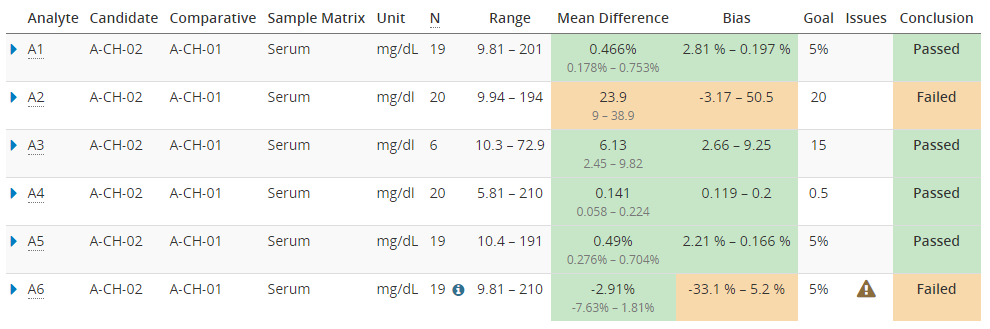
Image 10: The overview report, showing colors to make it easy to see where the goals have been met, and a warning for results with issues such as potential outliers.
When is regression analysis needed?
When you look at your difference plot, in some cases, you will see that the bias changes over the measuring range. In those cases, it is not enough to estimate bias with mean or median differences. Instead, you should use regression analysis to estimate how bias changes over the measuring interval. It may also be necessary to measure more samples to better cover the measuring range and get a more reliable estimate for bias.
For example, Image 11 shows us Bland-Altman plots using proportional (on the left) and absolute (on the right) scale. Both graphs visualize the behavior of the same fictional data set. The blue horizontal line in each graph represents the mean value (on a proportional or absolute scale) so that you can visually evaluate how well it describes the data set. In this data set, bias seems to be negative on low concentrations and positive on high concentrations. Neither of the graphs show constant bias, although, on a proportional scale, most of the data points are within 95% confidence interval (i.e., between the blue dotted lines). Yet, as on the absolute scale, bias seems pretty linear, and the scatter of the data points is quite even; there probably is no reason to treat the lowest concentration as an outlier. Therefore, it is advisable to use regression analysis to estimate bias as a function of concentration.
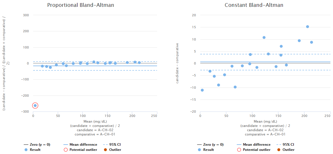
Image 11: Bland-Altman plots using proportional (on the left) and absolute (on the right) scale. Both graphs visualize the behavior of the same fictional data set.
Real data is not always scattered evenly enough that it would be easy to see how the bias behaves. Since Validation Manager gives you both mean difference and regression analysis automatically, you don’t have to wonder which one to calculate. Instead, you can look at both to decide whether your bias is small enough or not and which of them would describe your data set better.
If you want to learn more about regression analysis, you will probably like our next blog post around this topic of determining bias.
If you want to dig deeper into difference plots and related calculations, here are some references for you to go through:
- CLSI Approved Guideline EP09-A3 – Measurement Procedure Comparison and Bias Estimation Using Patient Samples
- J.M Bland & D.G. Altman (1995), “Comparing methods of measurement: why plotting difference against standard method is misleading”, The Lancet Vol 346 Issue 8982 p 1085-1087
- J.S. Krouwer (2008), “Why Bland-Altman plots should use X, not (Y-X)/2 when C is a reference method”, Statistics in Medicine Vol 27 Issue 5 p 778-780
- Wikipedia article about Bland-Altman plot has also useful references
Text originally published in , minor updates to contents on January 20, 2022
Accomplish more with less effort
See how Finbiosoft software services can transform the way your laboratory works.


